Documentation
Majestic
Thank you so much for purchasing our item.
If you have any questions that are beyond the scope of this help file, Please feel free to email via Item Support Page.
Theme Upload & Activation
Follow these steps to upload and activate the Majestic Shopify Theme in your Shopify store.
Step 1: Log in to Shopify Admin
- Open your Shopify Admin dashboard.
- From the left sidebar, navigate to Online Store → Themes.
Step 2: Upload the Theme
- In the Themes section, click the Add Theme button.
- Select Upload ZIP File from the dropdown menu.
- Click Choose File and select the Majestic Theme (.zip) file from your computer.
- Click Upload and wait for Shopify to process the theme.
Home Page
-
Login Shopify Store -> Online Store -> Click Edit icon -> Customizer options to left sidebar -> Home Page
This part contains the settings for all Home Page sections.
Announcement Bar Settings
-
Customizer -> Home Page -> Announcement Bar -> Click "Announcement Bar" Option -> Options open to right sidebar
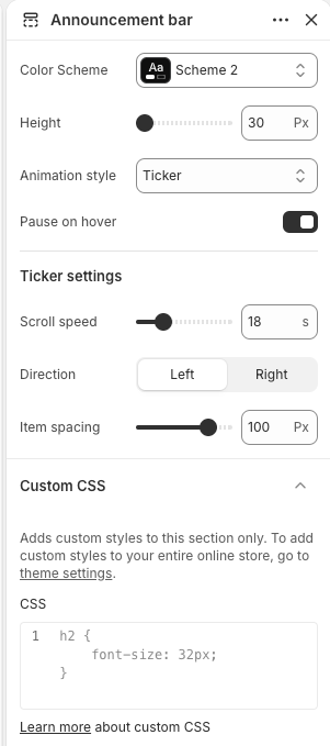
The Announcement Bar helps you display important messages, promotions, shipping updates, or store announcements at the top of your website.
Color Scheme
Select a predefined color scheme for the announcement bar.
- Choose from the available theme color schemes.
- Instantly update the background and text colors of the announcement bar.
Height
Adjust the height of the announcement bar.
- Move the Height slider right to increase the height of the announcement bar.
- Move the Height slider left to decrease the height.
Animation Style
Select how announcement messages are displayed on the announcement bar.
- Choose from the available animation styles.
- The selected animation is applied instantly to the announcement messages.
Pause on Hover
Enable or disable pausing the announcement animation when users hover over it.
- Turn On to pause the animation while hovering.
- Turn Off to keep the animation running continuously.
Scroll Speed
Adjust the scrolling speed of ticker announcements.
- Move the Scroll Speed slider right to slow down the scrolling animation.
- Move the Scroll Speed slider left to increase the scrolling speed.
Direction
Choose the scrolling direction for ticker announcements.
- Left – Messages scroll from right to left.
- Right – Messages scroll from left to right.
Item Spacing
Adjust the space between multiple ticker items.
- Move the Item Spacing slider right to increase the gap between items.
- Move the Item Spacing slider left to decrease the gap between items.
Custom CSS
Add custom CSS specifically for the Announcement Bar section.
- Enter custom CSS code to modify the appearance of the announcement bar.
- The CSS added here applies only to this section.
Header Menu Options
1. Create Main Menu and Footer Menu
Use Shopify Navigation settings to create and manage the Main Menu and Footer Menu for your store.
Shopify Admin -> Content -> Menus
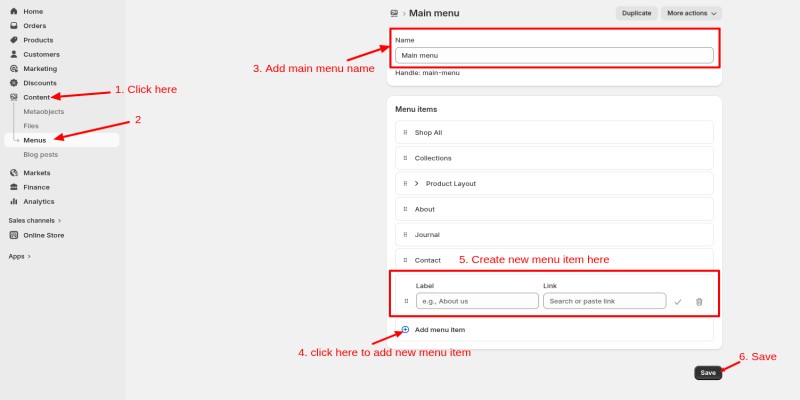
- Create or Edit Main Menu
- Open the Main Menu from the menu list.
- Click Add Menu Item.
- Enter a menu label and select a page, collection, product, blog, or custom URL.
- Repeat the process to add additional menu items.
- Drag and drop menu items to reorder them or create dropdown menus.
- Click Save to apply the changes.
- Create or Edit Footer Menu
- Open the Footer Menu from the menu list.
- Click Add Menu Item.
- Enter a menu label and select a page, collection, product, blog, or custom URL.
- Repeat the process to add additional footer links.
- Click Save to apply the changes.
2. Customizer Menu Settings
-
Customizer -> Home Page -> Click "Header" Option -> Options open to right sidebar
The Header section helps you customize the appearance and behavior of your website header.
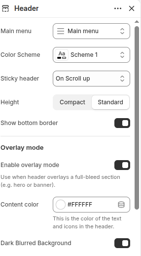
Main Menu
Select the menu that will be displayed in the header navigation area.
- Choose any available menu from your Shopify store.
- The selected menu will be displayed instantly in the header.
Color Scheme
Select a predefined color scheme for the header.
- Choose from the available theme color schemes.
- Instantly update the background and text colors of the header.
Sticky Header
Choose how the header behaves while scrolling.
- None – Header scrolls normally with the page.
- On Scroll Up – Header appears when scrolling upward.
- Always – Header remains visible while scrolling.
Height
Choose the height style for the header.
- Compact – Displays a smaller header height.
- Standard – Displays a regular header height.
Show Bottom Border
Enable or disable the bottom border of the header.
- Turn On to display a border below the header.
- Turn Off to hide the border.
Overlay Mode
Overlay Mode allows the header to appear over sections such as banners, sliders, or hero images.
Content Color
Select the color for header text and icons when overlay mode is enabled.
- Choose any available color.
- The selected color will be applied to header content instantly.
Dark Blurred Background
Enable or disable a dark blurred background effect for the overlay header.
- Turn On to display a dark blurred background behind the header.
- Turn Off to keep the header background transparent.
Logo Settings
The Logo settings allow you to manage logo visibility and images for the header.
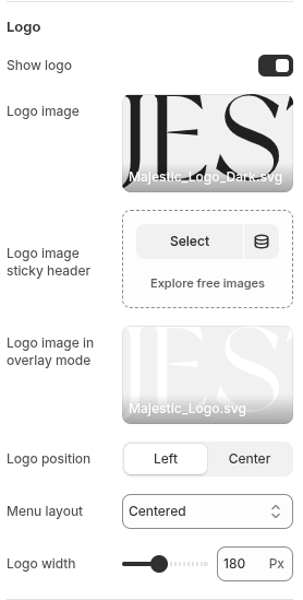
Show Logo
Enable or disable the logo display in the header.
- Turn On to display the logo.
- Turn Off to hide the logo.
Logo Image
Select the primary logo image for the header.
- Upload or choose an image from your media library.
- The selected image will be displayed as the header logo.
Logo Image Sticky Header
Select a logo image specifically for the sticky header.
- Upload or choose an image from your media library.
- The selected image will be displayed when the sticky header is active.
Logo Position
Choose the position of the logo within the header.
- Left – Displays the logo on the left side of the header.
- Center – Displays the logo in the center of the header.
Menu Layout
Select the layout style for the navigation menu.
- Choose from the available menu layout styles.
- The selected layout is applied instantly to the header menu.
Logo Width
Adjust the width of the logo displayed in the header.
- Move the Logo Width slider right to increase the logo size.
- Move the Logo Width slider left to decrease the logo size.
Localization
Localization settings help customers select their preferred country, region, and language.
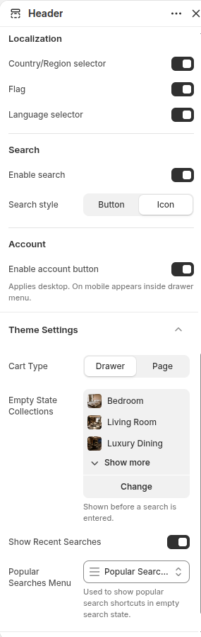
- Country/Region Selector: Enable or disable the country and region selector.
- Flag: Enable or disable country flags in the localization selector.
- Language Selector: Enable or disable the language selector.
Search
Search settings allow customers to quickly find products and content.
- Enable Search: Enable or disable the search feature.
- Search Style: Select the preferred search style.
Account
Account settings control customer account access from the header.
- Enable Account: Enable or disable the customer account button.
Theme Settings
Additional settings for cart behavior and search suggestions.
- Cart Type: Choose how the cart is displayed [Drawer/Page].
- Empty State Collections: Choose one or more collections from your store. Selected collections will be displayed as recommendations in the search area before a search is entered.
- Show Recent Searches: Enable or disable recently searched terms in the search interface.
- Popular Searches Menu: Select a menu containing popular search terms or shortcuts.
Overlay Group
Customize the popup overlay, position, alignment, and size.
-
Customizer -> Home Page -> Overlay Group -> Add Section -> Select "Subscribe Popup" -> Click "Subscribe Popup" -> Options to Right Sidebar
Subscribe Popup
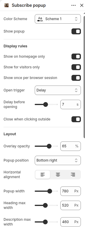
Color Scheme
Select a predefined color scheme for the subscribe popup.
- Choose from the available theme color schemes.
Show Popup
Enable or disable the subscribe popup.
- Turn On to display the popup on your store.
- Turn Off to hide the popup.
Display Rules
Show on Homepage Only
Control whether the popup appears only on the homepage.
- Turn On to display the popup only on the homepage.
- Turn Off to display the popup on other pages as well.
Show for Visitors Only
Control whether the popup is shown only to visitors.
- Turn On to display the popup only for visitors who are not logged in.
- Turn Off to display the popup for all users.
Show Once Per Browser Session
Control how often the popup is displayed.
- Turn On to show the popup only once during a browser session.
- Turn Off to allow the popup to appear repeatedly.
Open Trigger
Choose when the popup should appear.
- Select from the available trigger options.
- The popup will open based on the selected trigger.
Delay Before Opening
Set the delay before the popup appears.
- Move the slider right to increase the delay time.
- Move the slider left to decrease the delay time.
Close When Clicking Outside
Enable or disable closing the popup by clicking outside it.
- Turn On to allow users to close the popup by clicking outside.
- Turn Off to require users to use the close button.
Layout Settings
Overlay Opacity
Adjust the opacity of the popup overlay.
- Move the slider right to increase overlay darkness.
- Move the slider left to decrease overlay darkness.
Popup Position
Choose where the popup will appear on the screen.
- Select from the available popup position options.
- The popup will appear in the selected location.
Horizontal Alignment
Choose the horizontal alignment of popup content.
- Select Left, Center, or Right alignment.
Popup Width
Adjust the width of the popup.
- Move the slider right to increase the popup width.
- Move the slider left to decrease the popup width.
Heading Max Width
Set the maximum width of the popup heading.
- Move the slider right to increase the heading width.
- Move the slider left to decrease the heading width.
Description Max Width
Set the maximum width of the popup description.
- Move the slider right to increase the description width.
- Move the slider left to decrease the description width.
Image Settings
Customize the image displayed in the subscribe popup.
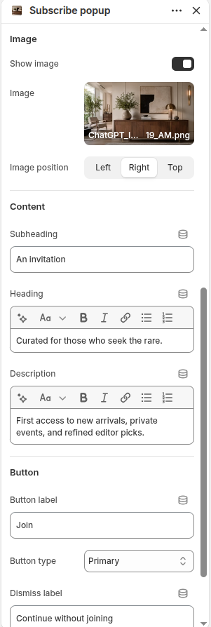
Show Popup Image
Enable or disable the popup image.
- Turn On to display an image in the popup.
- Turn Off to hide the image.
Image Position
Choose the position of the image within the popup.
- Left – Displays the image on the left side.
- Right – Displays the image on the right side.
- Top – Displays the image above the content.
Content Settings
Customize the text content displayed in the popup.
Subheading
Add a short text above the heading.
- Enter a subheading to provide additional context.
- The text will be displayed above the heading.
Heading
Add the main popup title.
- Enter a heading to attract visitors' attention.
- The heading will be displayed prominently in the popup.
Description
Add supporting text below the heading.
- Enter a description to provide additional information.
- The description will be displayed below the heading.
Button Settings
Customize the button options displayed in the popup.
Button Label
Add text for the popup button.
- Enter the button text.
- The label will be displayed on the button.
Button Type
Choose the style of the popup button.
- Select from the available button styles.
- The selected style will be applied instantly.
Dismiss Label
Add text for the dismiss option.
- Enter the dismiss label text.
- The label will be displayed as the option to close or dismiss the popup.
Home Sections: Template
The list of various section settings & its descriptions are provided below for your reference:
Hero Banner
This section is used to add and manage banner slides within the Hero Banner section
-
Click "Add Section" -> Search For "Hero Banner" Section -> Select it
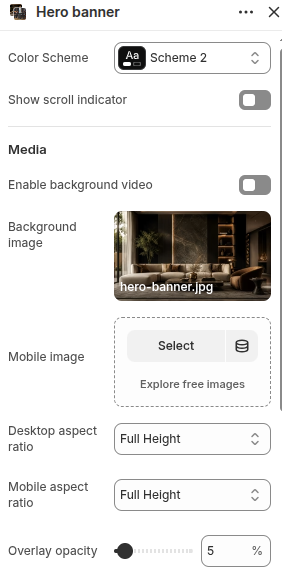
- Color Scheme: Select Color Scheme From Option.
- Show Scroll Indicator: Enable or Disable Scroll Indicator on Hero Banner.
- Enable Background Video: ON/OFF Video if you use video for hero slider.
- Background Image: Select/Add background image for hero banner.
- Mobile Image: Select/Add background image for mobile view hero banner.
- Desktop Aspect Ratio: Select from the available aspect ratio options.
- Mobile Aspect Ratio: Choose the display ratio for the banner on mobile devices.
-
Overlay Opacity:
- Move the slider right to increase overlay darkness.
- Move the slider left to decrease overlay darkness.
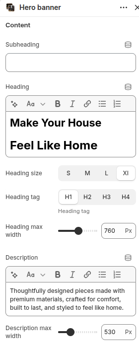
- Subheading: Add a short text above the main heading.
- Heading: Add the main title for the Hero Banner.
-
Heading Size: Choose the size of the heading text.
- S – Small heading size.
- M – Medium heading size.
- L – Large heading size.
- XL – Extra large heading size.
- Heading Tag: Choose the HTML tag for the heading (H1, H2, H3, H4).
- Heading Max Width: Adjust the maximum width of the heading by moving the slider left/right.
- Description: Add supporting text below the heading.
- Description Max Width: Adjust the maximum width of the description by moving the slider left/right.
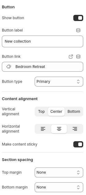
- Show Button: Enable or disable the banner button.
- Button Label: Enter the text you want to display on the button.
- Button Link: Choose a page, collection, product, or URL for the button link.
- Button Type: Select from the available button styles.
-
Vertical Alignment: Choose the vertical position of the content.
- Top – Align content to the top.
- Center – Align content to the center.
- Bottom – Align content to the bottom.
-
Horizontal Alignment: Choose the horizontal position of the content.
- Left – Align content to the left.
- Center – Align content to the center.
- Right – Align content to the right.
- Make Content Sticky: Enable or disable sticky content behavior.
- Top Margin: Select from the available margin options to control the spacing above the section.
- Bottom Margin: Select from the available margin options to control the spacing below the section.
Featured Collection
Use these settings to customize the appearance and functionality of the Featured Collection section.
-
Click "Add Section" -> Search For "Featured Collection" Section -> Select it
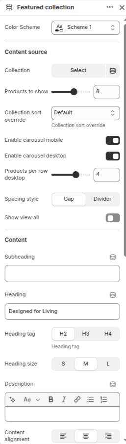
- Color Scheme: Select Color Scheme From Option.
- Collection: Select the collection to display in this section.
- Products to Show: Adjust the number of products displayed by moving the slider left or right.
- Collection Sort Override: Select a sorting option to override the collection's default product order.
- Enable Carousel Mobile: Enable or disable carousel functionality on mobile devices.
- Enable Carousel Desktop: Enable or disable carousel functionality on desktop devices.
- Products Per Row Desktop: Adjust the number of products displayed per row on desktop devices.
-
Spacing Style:
- Gap – Display products with spacing between items.
- Divider – Display products separated by divider lines.
- Show View All: Enable or disable the View All button for the selected collection.
- Subheading: Add a short text above the collection heading.
- Heading: Add the main title for the Featured Collection section.
-
Heading Tag:
Choose the HTML tag for the heading.
- H2 – Heading level 2.
- H3 – Heading level 3.
- H4 – Heading level 4.
-
Heading Size:
Choose the size of the heading text.
- S – Small heading size.
- M – Medium heading size.
- L – Large heading size.
- Description: Add supporting text below the heading.
-
Content Alignment:
- Left – Align content to the left.
- Center – Align content to the center.
- Right – Align content to the right.
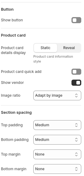
- Show Button: Enable or disable the section button.
-
Product Card Details Display:
Choose how product information is displayed.
- Static – Display product information at all times.
- Reveal – Display additional product information on hover.
- Product Card Quick Add: Enable or disable the quick add to cart button on product cards.
- Show Vendor: Enable or disable the display of the product vendor name.
- Image Ratio: Select from the available image ratio options for product images.
- Top Padding: Select from the available padding options to control the spacing above the section content.
- Bottom Padding: Select from the available padding options to control the spacing below the section content.
- Top Margin: Select from the available margin options to control the spacing above the section.
- Bottom Margin: Select from the available margin options to control the spacing below the section.
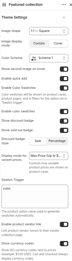
-
Image Shape:
Select the aspect ratio and shape used for product images.
- 1:1 – Square displays product images in a square format.
- Other available ratio options may be selected depending on your design preference.
-
Image Display Mode:
Controls how product images fit within the selected image shape.
- Contain – Displays the entire image without cropping.
- Cover – Fills the image area completely and may crop parts of the image.
- Color Scheme: Select a color scheme for the Featured Collection section from the available options.
- Show Second Image on Hover: Enable this option to display the product's second image when customers hover over a product card.
- Enable Quick Add: Enable or disable the Quick Add button on product cards, allowing customers to add products directly to the cart.
- Enable Color Swatches: Display color swatches on product cards and product pages for supported product options.
- Show Discount Badge: Enable this option to display a discount badge on products that are on sale.
- Show Sold Out Badge: Enable this option to display a Sold Out badge on products that are unavailable.
-
Discount Badge Style:
Choose how discount information is displayed on product cards.
- Sale – Displays a simple "Sale" label.
- Percentage – Displays the discount percentage (e.g., 20% Off).
-
Display Mode for Variant Prices:
Controls how product prices are displayed when products have multiple variants.
- Max Price (Up to $...) displays the highest variant price with an "Up To" format.
- Other available pricing display options can be selected as required.
-
Swatch Trigger:
Enter the product option name that should automatically generate color swatches.
- Example: color, colour, or any custom option name used in your products.
- Enable Product Vendor Link: Enable this option to make vendor names clickable and link them to their respective vendor collection pages.
-
Show Currency Codes:
Display the currency code next to product prices.
- Example: $10.00 USD instead of only $10.00.
- Cart and checkout pages will always display currency codes.
Add Collection Tabs
Configure collection tabs here to showcase multiple collections within the Featured Collection section.
-
Under Featured Collection -> Click "Add Collection tab" -> Create Collection tab (Follow the same steps to create multiple collection tabs)
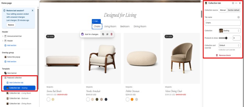
- Manual – Select a specific collection manually for this tab.
- Section Default – Use the default collection settings configured in the Featured Collection section.
- Default – Uses the sorting order defined in the selected collection.
- Other available sorting options can be selected based on your store requirements.
Selection Section
-
Click "Add Section" -> Search For "Selection" Section -> Select it
The list of various section settings & its descriptions are provided below for your reference:
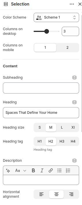
- 1 – Displays one item per row.
- 2 – Displays two items per row.
- S – Small heading size.
- M – Medium heading size.
- L – Large heading size.
- XL – Extra large heading size.
- H1 – Heading Level 1.
- H2 – Heading Level 2.
- H3 – Heading Level 3.
- H4 – Heading Level 4.
- Left – Align content to the left.
- Center – Align content to the center.
- Right – Align content to the right.
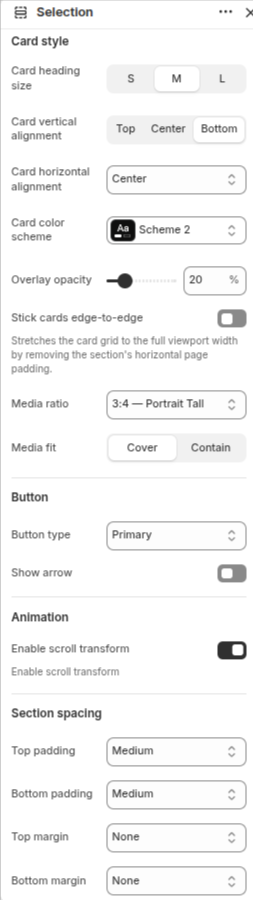
-
Card Heading Size:
Choose the size of the heading displayed within each card.
- S – Small heading size.
- M – Medium heading size.
- L – Large heading size.
-
Card Vertical Alignment:
Select the vertical position of the card content.
- Top – Align content to the top of the card.
- Center – Align content to the center of the card.
- Bottom – Align content to the bottom of the card.
-
Card Horizontal Alignment:
Choose the horizontal alignment of the card content.
- Left – Align content to the left.
- Center – Align content to the center.
- Right – Align content to the right.
- Card Color Scheme: Select a color scheme for the card content area from the available options.
-
Overlay Opacity:
Adjust the opacity of the image overlay.
- Move the slider right to increase overlay visibility.
- Move the slider left to decrease overlay visibility.
- Stick Cards Edge-to-Edge: Enable this option to stretch the card grid to the full viewport width by removing the section's horizontal page padding.
-
Media Ratio:
Select the aspect ratio used for card images.
- 3:4 – Portrait Tall displays images in a tall portrait format.
- Other available ratio options may be selected based on your design requirements.
-
Media Fit:
Controls how images fit within the selected media ratio.
- Cover – Fills the image area completely and may crop parts of the image.
- Contain – Displays the entire image without cropping.
- Button Type: Select the style of button displayed within the cards from the available button options.
- Show Arrow: Enable or disable the arrow icon displayed alongside the button text.
- Enable Scroll Transform: Enable this option to apply a scroll-based transform animation effect to the cards while scrolling.
- Top Padding: Select the amount of internal spacing above the section content.
- Bottom Padding: Select the amount of internal spacing below the section content.
- Top Margin: Select the amount of external spacing above the section.
- Bottom Margin: Select the amount of external spacing below the section.
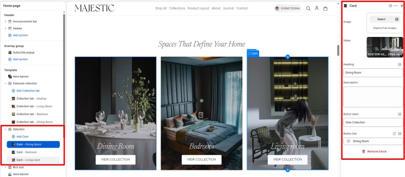
Add Cards
Configure individual cards within the Selection section to showcase different categories, collections, or room types with images, videos, headings, and buttons.
-
Under Selection -> Click "Add Card" -> Create Card (Follow the same steps to create multiple cards)
Rich Text Section
Use the Rich Text section to add customizable text content with headings, descriptions, buttons, and images. You can also add multiple content blocks to create a flexible content layout.
-
Click "Add Section" -> Search For "Rich text" -> Select it
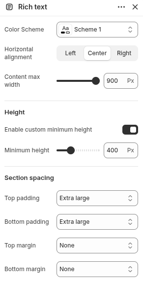
- Color Scheme: Select a color scheme for the Rich Text section from the available options.
-
Horizontal Alignment:
Choose the alignment of the content within the section.
- Left – Align content to the left.
- Center – Align content to the center.
- Right – Align content to the right.
- Content Max Width: Adjust the maximum width of the content area by moving the slider left or right.
- Enable Custom Minimum Height: Enable this option to set a custom minimum height for the Rich Text section.
- Minimum Height: Adjust the minimum height of the section by moving the slider left or right.
- Top Padding: Select the amount of internal spacing above the section content.
- Bottom Padding: Select the amount of internal spacing below the section content.
- Top Margin: Select the amount of external spacing above the section.
- Bottom Margin: Select the amount of external spacing below the section.
- Add Block: Click the Add Block button to insert new content elements inside the Rich Text section.
- Available Block Types:
- Heading: Add a heading/title block.
- Text: Add descriptive text or paragraph content.
- Button: Add a call-to-action button.
- Image: Add an image block.
- Apps: Insert supported Shopify app blocks.
- Subheading: Add a small text label displayed above the main heading.
- Heading: Enter the main heading text for the content section.
-
Heading Tag: Choose the HTML heading tag for SEO and content hierarchy.
- H1 – Primary page heading.
- H2 – Secondary heading.
- H3 – Tertiary heading.
- H4 – Smaller heading level.
-
Heading Size: Select the display size of the heading.
- S – Small size heading.
- M – Medium size heading.
- L – Large size heading.
- Remove Block: Click to remove the heading block from the Rich Text section.
Add Block
Configure blocks within the Rich Text section to display Heading, Text, Button, Image with customizable.
-
Under Rich Text -> Click "Add Block" -> Select "Heading" and others options as you want
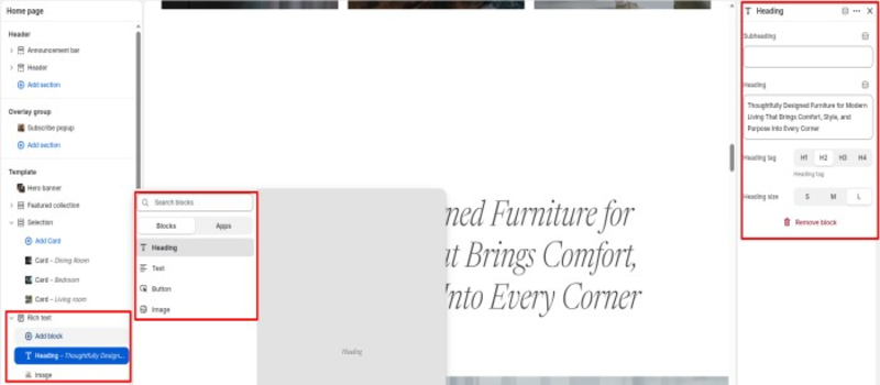
- H1: Primary page heading.
- H2: Secondary heading.
- H3: Tertiary heading.
- H4: Smaller section heading.
- S: Small heading size.
- M: Medium heading size.
- L: Large heading size.
Product Bundle Section
Configure the Product Bundle section to showcase multiple products together and encourage customers to purchase related items as a bundle.
-
Click "Add Section" -> Search For "Product Bundle" Section -> Select it
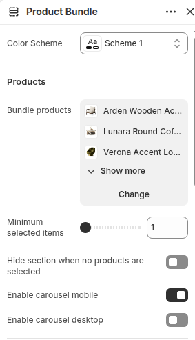
- Bundle Products: Select the products that will be displayed within the Product Bundle section. Customers can choose from these products when purchasing the bundle.
- Show More: Click this option to view all selected products when multiple products have been added to the bundle.
- Change: Click to add, remove, or replace products within the bundle.
- Minimum Selected Items: Set the minimum number of products customers must select before adding the bundle to the cart.
- Hide Section When No Products Are Selected: Enable this option to automatically hide the Product Bundle section when no products have been assigned.
- Enable Carousel Mobile: Enable this option to display bundle products in a carousel layout on mobile devices.
- Enable Carousel Desktop: Enable this option to display bundle products in a carousel layout on desktop devices.
- Color Scheme: Select a color scheme from the available options to match the Product Bundle section with your store design.
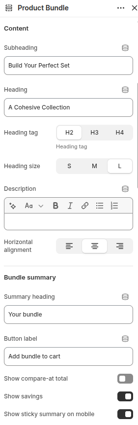
- Subheading: Enter a short text that appears above the main heading to introduce the Product Bundle section.
- Heading: Enter the main title displayed for the Product Bundle section.
-
Heading Tag:
Select the HTML heading tag for proper content hierarchy and SEO.
- H2: Secondary page heading.
- H3: Sub-section heading.
- H4: Smaller section heading.
-
Heading Size:
Choose the visual size of the heading text.
- S: Small heading size.
- M: Medium heading size.
- L: Large heading size.
- Description: Add supporting text below the heading to provide additional information about the bundle.
-
Horizontal Alignment:
Choose the alignment of the section content.
- Left: Align content to the left.
- Center: Align content to the center.
- Right: Align content to the right.
- Summary Heading: Enter the title displayed above the bundle summary area.
- Button Label: Enter the text that appears on the bundle purchase button.
- Show Compare-at Total: Enable this option to display the original combined price of all selected products before any discounts are applied.
- Show Savings: Enable this option to display the total amount customers save when purchasing the bundle.
- Show Sticky Summary on Mobile: Enable this option to keep the bundle summary visible while customers scroll on mobile devices.
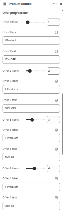
- Offer Progress Bar: Controls the progress indicator that visually represents the number of bundle offers. Adjust the slider to define how many offer levels are available.
- Offer 1 Items: Set the number of items required for the first bundle offer level. This value determines when the first discount becomes active.
- Offer 1 Label: Enter the label text for the first bundle level (e.g., "1 Product").
- Offer 1 Text: Enter the discount text displayed for the first offer (e.g., "15% OFF").
- Offer 2 Items: Set the number of items required for the second bundle offer level.
- Offer 2 Label: Enter the label text for the second bundle level (e.g., "2 Products").
- Offer 2 Text: Enter the discount text displayed for the second offer (e.g., "30% OFF").
- Offer 3 Items: Set the number of items required for the third bundle offer level.
- Offer 3 Label: Enter the label text for the third bundle level (e.g., "3 Products").
- Offer 3 Text: Enter the discount text displayed for the third offer (e.g., "45% OFF").
- Offer 4 Items: Set the number of items required for the fourth bundle offer level.
- Offer 4 Label: Enter the label text for the fourth bundle level (e.g., "4 Products").
- Offer 4 Text: Enter the discount text displayed for the fourth offer (e.g., "60% OFF").
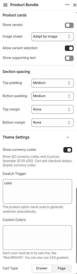
- Show Vendor: Enable or disable the display of the product vendor name.
- Image Shape: Select from the available image shape options for product images.
- Allow Variant Selection: Enable or disable variant selection directly from the product card.
- Show Supporting Text: Enable or disable supporting text on product cards.
- Top Padding: Select from the available padding options to control the spacing above the section content.
- Bottom Padding: Select from the available padding options to control the spacing below the section content.
- Top Margin: Select from the available margin options to control the spacing above the section.
- Bottom Margin: Select from the available margin options to control the spacing below the section.
- Show Currency Codes: Enable or disable the display of currency codes next to product prices.
- Swatch Trigger: Enter the product option name that should be used to generate color swatches automatically.
- Custom Colors: Add custom color values for swatches. Enter one color per line using the specified format.
-
Cart Type:
- Drawer – Opens the cart in a slide-out drawer.
- Page – Opens the cart on a dedicated cart page.
Shop By Collection Section
Configure the Shop by collection section to showcase multiple selected collections
-
Click "Add Section" -> Search For "Shop by collection" Section -> Select it
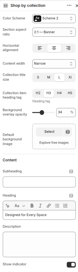
- Left – Align content to the left.
- Center – Align content to the center.
- Right – Align content to the right.
- S – Small title size.
- M – Medium title size.
- L – Large title size.
- XL – Extra large title size.
- H2 – Heading level 2.
- H3 – Heading level 3.
- H4 – Heading level 4.
- H5 – Heading level 5.
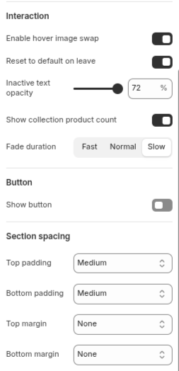
- Enable Hover Image Swap: Enable or disable swapping the collection image when hovering over a collection item.
- Reset to Default on Leave: Enable this option to restore the default collection image when the cursor leaves the collection item.
- Inactive Text Opacity: Adjust the opacity of inactive collection text by moving the slider left or right.
- Show Collection Product Count: Enable or disable the display of the total number of products in each collection.
-
Fade Duration:
Choose the transition speed for collection image and content effects.
- Fast – Applies a quick transition effect.
- Normal – Applies a standard transition effect.
- Slow – Applies a slower transition effect.
- Show Button: Enable or disable the section button.
- Top Padding: Select from the available padding options to control the spacing above the section content.
- Bottom Padding: Select from the available padding options to control the spacing below the section content.
- Top Margin: Select from the available margin options to control the spacing above the section.
- Bottom Margin: Select from the available margin options to control the spacing below the section.
Add Collection Items
Configure individual collection items within the Shop by Collection section to showcase different collections with custom titles, images, and location details.
-
Under Shop by Collection -> Click "Add Collection Item" -> Configure Collection Item Settings (Follow the same steps to create multiple collection items)
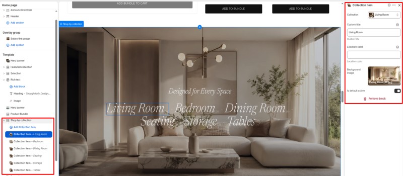
- Collection: Select the collection to display for this collection item.
- Custom Title: Enter a custom title to override the selected collection title.
- Location Code: Enter a location code or short label to display additional information for the collection item.
- Background Image: Select or upload a background image for the collection item.
- Is Default Active: Enable this option to make the collection item active by default when the section loads.
Text With Image Section
Configure the Text With Image section to display engaging content alongside images, helping you highlight products, collections, services, or brand stories.
-
Click "Add Section" -> Search For "Text With Image" Section -> Select it
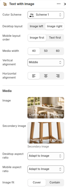
- Color Scheme: Select a color scheme from the available options to match the Text With Image section with your store design.
-
Desktop Layout:
Choose the image position on desktop devices.
- Image Left: Displays the image on the left side and content on the right.
- Image Right: Displays the image on the right side and content on the left.
-
Mobile Layout Order:
Control the order in which content appears on mobile devices.
- Image First: Shows the image before the content.
- Text First: Shows the content before the image.
-
Media Width:
Adjust the width ratio of the image area relative to the content area.
- 40: Smaller image area.
- 50: Equal width for image and content.
- 60: Larger image area.
-
Vertical Alignment:
Select how the content aligns vertically within the section.
- Top: Align content to the top.
- Middle: Center content vertically.
- Bottom: Align content to the bottom.
-
Horizontal Alignment:
Choose the alignment of the text content.
- Left: Align content to the left.
- Center: Align content to the center.
- Right: Align content to the right.
- Image: Upload or select the primary image displayed within the section.
- Secondary Image: Upload or select an optional secondary image that appears alongside the main image for additional visual impact.
-
Desktop Aspect Ratio:
Select how the image aspect ratio is displayed on desktop devices.
- Adapt to Image: Uses the original image dimensions.
- Square: Displays the image in a square format.
- Portrait: Displays the image in a vertical format.
- Mobile Aspect Ratio: Select how the image aspect ratio is displayed on mobile devices.
-
Image Fit:
Control how the image fits inside its container.
- Cover: Fills the entire image area and may crop portions of the image.
- Contain: Displays the entire image without cropping.
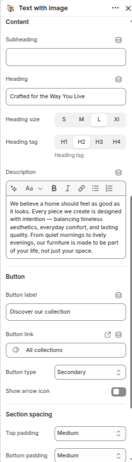
- Subheading: Enter a short text displayed above the main heading to introduce the section.
- Heading: Enter the main title displayed in the Text With Image section.
-
Heading Size:
Choose the visual size of the heading text.
- S: Small heading size.
- M: Medium heading size.
- L: Large heading size.
- XL: Extra-large heading size.
-
Heading Tag:
Select the HTML heading tag for proper content hierarchy and SEO.
- H1: Primary page heading.
- H2: Secondary page heading.
- H3: Sub-section heading.
- H4: Smaller section heading.
- Description: Add supporting text that appears below the heading to provide more information.
- Button Label: Enter the text displayed on the button.
- Button Link: Select the destination page, collection, product, or URL that opens when the button is clicked.
-
Button Type:
Choose the visual style of the button.
- Primary: Uses the primary button style from the theme.
- Secondary: Uses the secondary button style from the theme.
- Show Arrow Icon: Enable this option to display an arrow icon inside the button.
- Top Padding: Select from the available padding options to control the spacing above the section content.
- Bottom Padding: Select from the available padding options to control the spacing below the section content.
Featured Products Section
Configure the Featured Products section to showcase selected products and help customers discover popular or highlighted items.
-
Click "Add Section" -> Search For "Featured Products" Section -> Select it
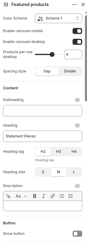
- Color Scheme: Select a color scheme from the available options to match the Featured Products section with your store design.
- Enable Carousel Mobile: Enable this option to display products in a carousel layout on mobile devices.
- Enable Carousel Desktop: Enable this option to display products in a carousel layout on desktop devices.
- Products Per Row Desktop: Adjust the number of product cards displayed in each row on desktop devices.
-
Spacing Style:
Choose the spacing style between product cards.
- Gap: Adds spacing between product cards.
- Divider: Separates product cards using divider lines.
- Subheading: Enter a short text displayed above the main heading.
- Heading: Enter the main title displayed for the Featured Products section.
-
Heading Tag:
Select the HTML heading tag for proper content hierarchy and SEO.
- H2: Secondary page heading.
- H3: Sub-section heading.
- H4: Smaller section heading.
-
Heading Size:
Choose the visual size of the heading text.
- S: Small heading size.
- M: Medium heading size.
- L: Large heading size.
- Description: Add supporting text below the heading.
- Show Button: Enable or disable the section button.
-
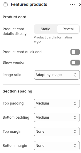
Product Card Details Display:
Choose the style used to display product information.
- Static: Product information remains visible at all times.
- Reveal: Product information appears with an interaction effect.
- Product Card Quick Add: Enable or disable the quick add-to-cart button on product cards.
- Show Vendor: Enable or disable the display of product vendor names.
- Image Ratio: Select the aspect ratio used for product images.
- Top Padding: Select from the available padding options to control the spacing above the section content.
- Bottom Padding: Select from the available padding options to control the spacing below the section content.
- Top Margin: Select from the available margin options to control the spacing above the section.
- Bottom Margin: Select from the available margin options to control the spacing below the section.
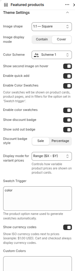
- Image Shape: Select the shape used for product images.
-
Image Display Mode:
Control how product images fit inside their containers.
- Contain: Displays the complete image without cropping.
- Cover: Fills the entire image area and may crop parts of the image.
- Color Scheme: Select a color scheme from the available options.
- Show Second Image on Hover: Enable this option to display the secondary product image when customers hover over a product card.
- Enable Quick Add: Enable this option to display a quick add-to-cart button on product cards.
- Enable Color Swatches: Enable this option to display product color swatches on product cards.
- Enable Color Swatches: Enable or disable color swatch functionality globally.
- Show Discount Badge: Enable this option to display discount badges on products.
- Show Sold Out Badge: Enable this option to display a sold-out badge for unavailable products.
-
Discount Badge Style:
Choose how discount information is displayed.
- Sale: Displays a sale label.
- Percentage: Displays the discount percentage.
- Display Mode for Variant Prices: Select how product prices are displayed when products have multiple variants.
- Swatch Trigger: Enter the product option name used to generate color swatches automatically (e.g., Color).
- Show Currency Codes: Enable this option to display ISO currency codes next to prices.
- Custom Colors: Add custom color values for swatches. Enter one color per line using the required format.
Add Products
Configure individual product blocks within the Featured Products section to showcase selected products with custom images and highlight badges.
-
Under Featured Products -> Click "Add Product" -> Configure Product Settings (Follow the same steps to add multiple products)
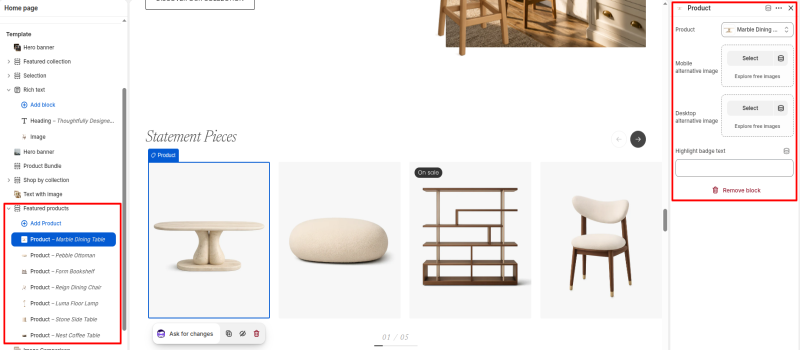
- Product: Select the product that will be displayed in the Featured Products section.
- Mobile Alternative Image: Select or upload an alternative image that will be displayed for this product on mobile devices.
- Desktop Alternative Image: Select or upload an alternative image that will be displayed for this product on desktop devices.
- Highlight Badge Text: Enter custom text to display a badge on the product card, such as "New", "Best Seller", or "On Sale".
Image Comparison Section
Configure the Image Comparison section to showcase before-and-after images with an interactive comparison slider, helping customers visualize transformations and results.
-
Click "Add Section" -> Search For "Image Comparison" Section -> Select it
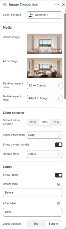
- Color Scheme: Select a color scheme from the available options to match the Image Comparison section with your store design.
- Before Image: Upload or select the image displayed before the comparison slider.
- After Image: Upload or select the image displayed after the comparison slider.
-
Desktop Aspect Ratio:
Choose the image aspect ratio for desktop devices.
- 3:2 – Classic: Displays images in a classic landscape format.
- Adapt to Image: Uses the original image dimensions.
- Mobile Aspect Ratio: Choose the image aspect ratio for mobile devices.
-
Default Slider Position:
Set the initial position of the comparison slider.
- 25%: Starts closer to the before image.
- 50%: Starts in the center.
- 75%: Starts closer to the after image.
- Slider Interaction: Select how users interact with the comparison slider.
- Show Divider Handle: Enable or disable the divider handle displayed on the comparison slider.
- Handle Style: Select the visual style of the slider handle.
- Show Labels: Enable or disable labels on the comparison images.
- Before Label: Enter the text displayed on the before image.
- After Label: Enter the text displayed on the after image.
-
Label Position:
Choose where labels appear on the images.
- Top: Displays labels at the top of the images.
- Bottom: Displays labels at the bottom of the images.
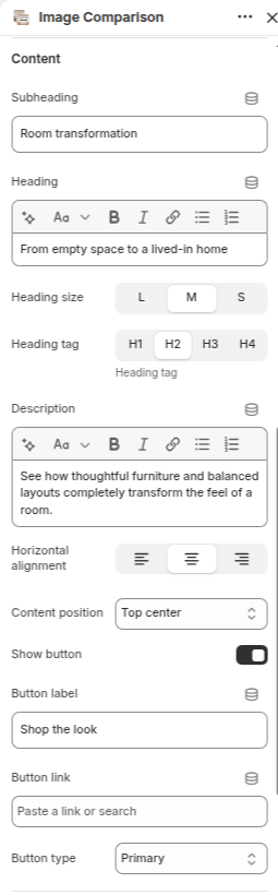
- Subheading: Enter a short text displayed above the main heading.
- Heading: Enter the main title displayed in the Image Comparison section.
-
Heading Size:
Choose the visual size of the heading text.
- L: Large heading size.
- M: Medium heading size.
- S: Small heading size.
-
Heading Tag:
Select the HTML heading tag for proper content hierarchy and SEO.
- H1: Primary page heading.
- H2: Secondary page heading.
- H3: Sub-section heading.
- H4: Smaller section heading.
- Description: Add supporting text below the heading.
-
Horizontal Alignment:
Choose the alignment of the content.
- Left: Align content to the left.
- Center: Align content to the center.
- Right: Align content to the right.
- Content Position: Select the position of the content within the section.
- Show Button: Enable or disable the section button.
- Button Label: Enter the text displayed on the button.
- Button Link: Select the destination page, collection, product, or URL that opens when the button is clicked.
-
Button Type:
Choose the visual style of the button.
- Primary: Uses the primary button style from the theme.
- Secondary: Uses the secondary button style from the theme.
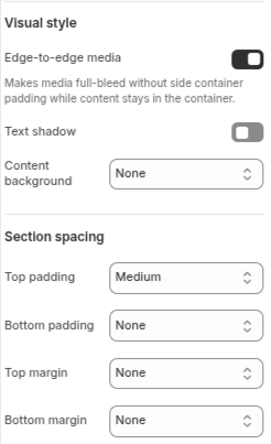
- Edge-to-Edge Media: Enable this option to display images in a full-width layout without side container padding while keeping content inside the container.
- Text Shadow: Enable or disable a shadow effect behind text to improve readability.
- Content Background: Select a background style for the content area.
- Top Padding: Select from the available padding options to control the spacing above the section content.
- Bottom Padding: Select from the available padding options to control the spacing below the section content.
- Top Margin: Select from the available margin options to control the spacing above the section.
- Bottom Margin: Select from the available margin options to control the spacing below the section.
Editorial Scroll Section
Configure the Editorial Scroll section to create an immersive horizontal storytelling experience with animated cards, images, and featured products.
-
Click "Add Section" -> Search For "Editorial Scroll" Section -> Select it
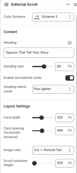
- Color Scheme: Select a color scheme from the available options to match the Editorial Scroll section with your store design.
- Heading: Enter the main title displayed within the Editorial Scroll section.
- Heading Size: Adjust the heading size using the slider.
- Enable Text Behind Cards: Enable this option to display the heading behind the scrolling cards.
- Heading Blend Mode: Select the blend mode used for the heading text when displayed behind cards.
- Card Width: Adjust the width of each editorial card using the slider.
- Card Spacing (Horizontal Distance): Adjust the horizontal spacing between cards.
- Image Ratio: Select the aspect ratio used for card images.
- Scroll Container Height: Adjust the height of the scroll container.
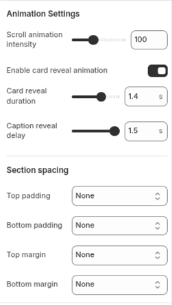
- Scroll Animation Intensity: Adjust the intensity of the card movement during scrolling.
- Enable Card Reveal Animation: Enable or disable reveal animations when cards appear.
- Card Reveal Duration: Adjust the duration of the card reveal animation.
- Caption Reveal Delay: Set the delay before card captions become visible.
- Top Padding: Select from the available padding options to control the spacing above the section content.
- Bottom Padding: Select from the available padding options to control the spacing below the section content.
- Top Margin: Select from the available margin options to control the spacing above the section.
- Bottom Margin: Select from the available margin options to control the spacing below the section.
Add Editorial Cards
Configure individual editorial cards within the Editorial Scroll section to showcase products, images, and storytelling content.
-
Under Editorial Scroll -> Click "Add Editorial Card" -> Configure Card Settings (Follow the same steps to create multiple editorial cards)
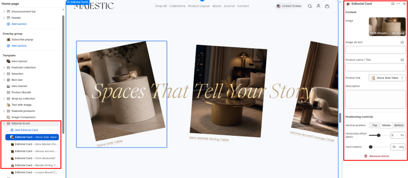
- Image: Select or upload the image displayed for the editorial card.
- Image Alt Text: Enter descriptive alternative text for the image to improve accessibility and SEO.
- Product Name / Title: Enter a custom title or product name displayed below the card image.
- Product Link: Select the product, collection, page, or URL that opens when the card is clicked.
- Description: Add supporting text or a short description for the editorial card.
- Positioning Controls: Adjust the vertical position, horizontal offset, and rotation of the card to create a unique editorial layout.
Ticker Section
Configure the Ticker section to display scrolling text, logos, and promotional messages in a continuously moving ticker layout.
-
Click "Add Section" -> Search For "Ticker" Section -> Select it
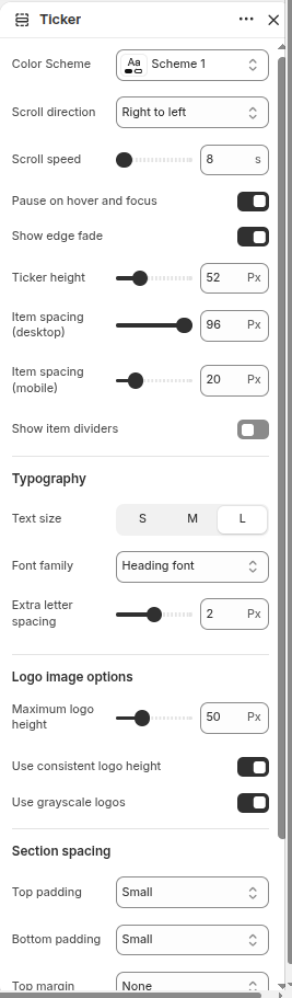
- Color Scheme: Select a color scheme from the available options to match the Ticker section with your store design.
- Scroll Direction: Choose the direction in which ticker items move.
- Scroll Speed: Adjust the scrolling speed of ticker items.
- Pause on Hover and Focus: Enable this option to pause ticker movement when customers hover over or focus on the ticker.
- Show Edge Fade: Enable this option to display a fade effect at the edges of the ticker.
- Ticker Height: Adjust the height of the ticker section.
- Item Spacing (Desktop): Adjust the spacing between ticker items on desktop devices.
- Item Spacing (Mobile): Adjust the spacing between ticker items on mobile devices.
- Show Item Dividers: Enable this option to display dividers between ticker items.
-
Text Size:
Choose the display size of ticker text.
- S: Small text size.
- M: Medium text size.
- L: Large text size.
- Font Family: Select the font family used for ticker text.
- Extra Letter Spacing: Adjust the spacing between characters.
- Maximum Logo Height: Set the maximum height for logo images displayed in the ticker.
- Use Consistent Logo Height: Enable this option to display all logos with the same height.
- Use Grayscale Logos: Enable this option to display logo images in grayscale.
- Top Padding: Select from the available padding options to control the spacing above the section content.
- Bottom Padding: Select from the available padding options to control the spacing below the section content.
- Top Margin: Select from the available margin options to control the spacing above the section.
- Bottom Margin: Select from the available margin options to control the spacing below the section.
Add Blocks
Configure blocks within the Ticker section to display logos and text items inside the scrolling ticker.
-
Under Ticker -> Click "Add Block" -> Select "Logo Image" or "Text" -> Configure Block Settings (Follow the same steps to create multiple blocks)
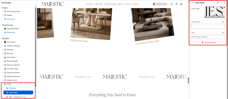
- Logo Image: Select or upload the logo image displayed in the ticker.
- Logo Alt Text: Enter descriptive alternative text for the logo image to improve accessibility and SEO.
- Link: Select a page, product, collection, or enter a custom URL that opens when the logo is clicked.
- Remove Block: Click this option to delete the logo image block from the ticker.
Collapsible Content Section
Configure the Collapsible Content section to display frequently asked questions, product information, or expandable content in an accordion-style layout.
-
Click "Add Section" -> Search For "Collapsible Content" Section -> Select it
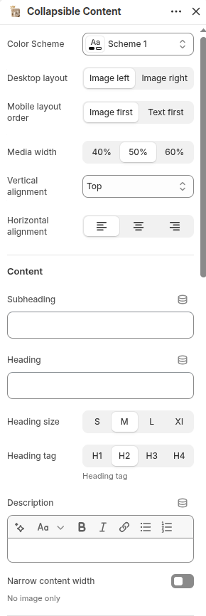
- Color Scheme: Select a color scheme from the available options.
-
Desktop Layout:
Choose the image position on desktop devices.
- Image Left – Display the image on the left side.
- Image Right – Display the image on the right side.
-
Mobile Layout Order:
Choose the display order on mobile devices.
- Image First – Display the image before the content.
- Text First – Display the content before the image.
- Media Width: Select the width of the media area from the available options.
- Vertical Alignment: Choose the vertical alignment of the content.
-
Horizontal Alignment:
Choose the horizontal position of the content.
- Left – Align content to the left.
- Center – Align content to the center.
- Right – Align content to the right.
- Subheading: Add a short text above the main heading.
- Heading: Add the main title for the section.
-
Heading Size:
Choose the size of the heading text.
- S – Small heading size.
- M – Medium heading size.
- L – Large heading size.
- XL – Extra large heading size.
- Heading Tag: Choose the HTML tag for the heading (H1, H2, H3, H4).
- Description: Add supporting text below the heading.
- Narrow Content Width: Enable or disable a narrower content area for the section.
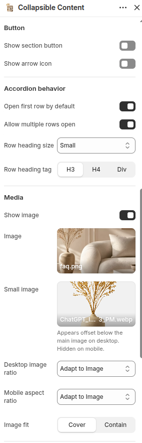
- Show Section Button: Enable or disable the section button.
- Show Arrow Icon: Enable or disable arrow icons for accordion rows.
- Open First Row By Default: Enable this option to automatically open the first accordion row.
- Allow Multiple Rows Open: Enable this option to allow multiple accordion rows to remain open at the same time.
- Row Heading Size: Select the size of accordion row headings.
-
Row Heading Tag:
Choose the HTML tag used for row headings.
- H3 – Heading level 3.
- H4 – Heading level 4.
- Div – Uses a standard div element.
- Show Image: Enable or disable the section image.
- Image: Select or upload the main image displayed in the section.
- Small Image: Select or upload the decorative offset image displayed below the main image.
- Desktop Image Ratio: Select the image ratio used on desktop devices.
- Mobile Aspect Ratio: Select the image ratio used on mobile devices.
-
Image Fit:
Controls how images fit within the image area.
- Cover – Fills the image area completely and may crop parts of the image.
- Contain – Displays the entire image without cropping.
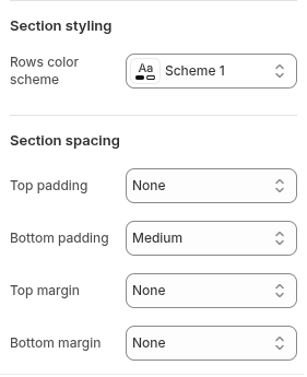
- Rows Color Scheme: Select a color scheme for the accordion rows.
- Top Padding: Select from the available padding options to control the spacing above the section content.
- Bottom Padding: Select from the available padding options to control the spacing below the section content.
- Top Margin: Select from the available margin options to control the spacing above the section.
- Bottom Margin: Select from the available margin options to control the spacing below the section.
Add Rows
Configure individual rows within the Collapsible Content section to display expandable content, FAQs, or additional information.
-
Under Collapsible Content -> Click "Add Row" -> Configure Row Settings (Follow the same steps to create multiple rows)
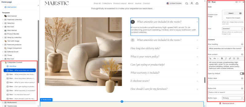
- Custom Icon Image: Select or upload a custom icon image for the accordion row.
- Icon: Select an icon from the available icon options.
- Row Heading: Enter the title displayed for the accordion row.
- Row Content: Add the content displayed when the accordion row is expanded.
- Open By Default: Enable this option to keep the row expanded when the page loads.
- Button Label: Enter the text displayed on the row button.
- Button Link: Select a page, collection, product, or URL for the row button.
- Button Type: Select from the available button styles.
Multicolumn Section
Configure the Multicolumn section to display multiple content blocks with icons, images, headings, descriptions, and optional links in a flexible column layout.
-
Click "Add Section" -> Search For "Multicolumn" Section -> Select it
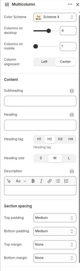
- Color Scheme: Select a color scheme from the available options.
- Columns on Desktop: Choose how many columns are displayed on desktop devices.
- Columns on Mobile: Choose how many columns are displayed on mobile devices.
-
Column Alignment:
Choose the alignment of column content.
- Left – Align content to the left.
- Center – Align content to the center.
- Subheading: Add a short text above the main heading.
- Heading: Add the main title for the section.
-
Heading Tag:
Choose the HTML tag used for the section heading.
- H1 – Heading level 1.
- H2 – Heading level 2.
- H3 – Heading level 3.
- H4 – Heading level 4.
-
Heading Size:
Select the size of the heading.
- S – Small heading size.
- M – Medium heading size.
- L – Large heading size.
- Description: Add supporting text below the heading.
- Top Padding: Select the spacing above the section content.
- Bottom Padding: Select the spacing below the section content.
- Top Margin: Select the spacing above the section.
- Bottom Margin: Select the spacing below the section.
Add Columns
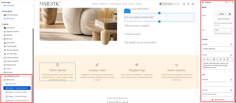
Configure individual columns within the Multicolumn section to showcase features, services, benefits, or informational content.
-
Under Multicolumn -> Click "Add Column" -> Configure Column Settings (Follow the same steps to create multiple columns)
- Image: Select or upload an image for the column.
- Icon: Select an icon from the available icon library. Icons are displayed when no image is selected.
- Heading: Enter the column title.
- Content: Add descriptive text for the column.
- Link Label: Enter the text displayed for the column link.
- Link URL: Select a page, product, collection, or enter a custom URL.
Testimonials Section
Configure the Testimonials section to showcase customer reviews, feedback, and success stories in an interactive testimonial slider.
-
Click "Add Section" -> Search For "Testimonials" Section -> Select it
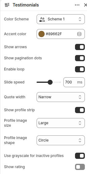
- Color Scheme: Select a color scheme from the available options.
- Accent Color: Select the accent color used for icons, ratings, and highlights.
- Show Arrows: Enable or disable slider navigation arrows.
- Show Pagination Dots: Enable or disable pagination indicators below the slider.
- Enable Loop: Enable continuous looping of testimonial slides.
- Slide Speed: Control the transition speed between testimonial slides.
-
Quote Width:
Select the width of the testimonial quote area.
- Narrow – Displays a compact quote layout.
- Medium – Displays a balanced quote width.
- Wide – Displays a larger quote area.
- Show Profile Strip: Enable or disable the profile navigation strip below the testimonials.
- Profile Image Size: Select the size of profile images.
-
Profile Image Shape:
Choose the shape of profile images.
- Circle – Displays profile images in a circular shape.
- Square – Displays profile images in a square shape.
- Use Grayscale for Inactive Profiles: Display inactive profile images in grayscale.
- Show Rating: Enable or disable review ratings.
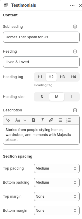
- Subheading: Add a short text above the main heading.
- Heading: Add the main title for the section.
-
Heading Tag:
Choose the HTML tag used for the section heading.
- H1 – Heading level 1.
- H2 – Heading level 2.
- H3 – Heading level 3.
- H4 – Heading level 4.
-
Heading Size:
Select the size of the heading.
- S – Small heading size.
- M – Medium heading size.
- L – Large heading size.
- Description: Add supporting text below the heading.
- Top Padding: Select the spacing above the section content.
- Bottom Padding: Select the spacing below the section content.
- Top Margin: Select the spacing above the section.
- Bottom Margin: Select the spacing below the section.
Add Testimonials
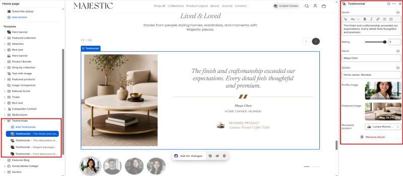
Configure individual testimonial blocks to display customer reviews, profile information, ratings, and related products.
-
Under Testimonials -> Click "Add Testimonial" -> Configure Testimonial Settings (Follow the same steps to create multiple testimonials)
- Quote: Enter the testimonial or review content.
- Rating: Select the customer rating displayed with the testimonial.
- Name: Enter the customer's name.
- Details: Add additional customer information such as location, designation, or company name.
- Profile Image: Select or upload the customer's profile image.
- Featured Image: Select or upload an image associated with the testimonial.
- Reviewed Product: Select the product being reviewed and displayed within the testimonial.
Featured Blog Section
Step 1: Create Blog Categories and Blogs
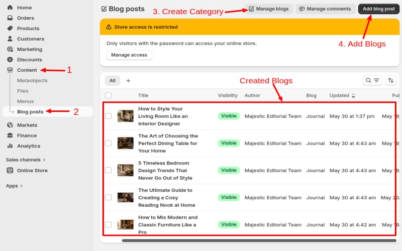
Follow the steps below to create blog categories and add blog posts in your Shopify store.
-
Create a Blog Category:
Shopify Admin -> Content -> Blog Posts -> Manage Blogs -> Add Blog - Enter the blog name (category name).
- Click Save to create the blog category.
-
Create a Blog Post:
Shopify Admin -> Content -> Blog Posts -> Add Blog Post - Enter the blog post title and content.
- Select the desired blog category from the Blog dropdown.
- Add a featured image, tags, excerpt, and SEO information if required.
- Set the visibility and publishing date.
- Click Save or Publish to publish the blog post.
Step 2: Show Blogs To Featured Blog Section On Home Page
Configure the Featured Blog section to display recent articles from your blog, helping visitors discover news, stories, guides, and updates.
-
Click "Add Section" -> Search For "Featured Blog" Section -> Select it
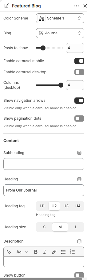
- Color Scheme: Select a color scheme from the available options.
- Blog: Select the blog whose articles will be displayed in the section.
- Posts to Show: Choose the number of blog posts displayed.
- Enable Carousel Mobile: Enable or disable carousel functionality on mobile devices.
- Enable Carousel Desktop: Enable or disable carousel functionality on desktop devices.
- Columns (Desktop): Select how many blog cards are displayed per row on desktop devices.
- Show Navigation Arrows: Enable or disable carousel navigation arrows.
- Show Pagination Dots: Enable or disable pagination indicators for the carousel.
- Subheading: Add a short text above the main heading.
- Heading: Add the main title for the section.
-
Heading Tag:
Choose the HTML tag used for the section heading.
- H1 – Heading level 1.
- H2 – Heading level 2.
- H3 – Heading level 3.
- H4 – Heading level 4.
-
Heading Size:
Select the size of the heading.
- S – Small heading size.
- M – Medium heading size.
- L – Large heading size.
- Description: Add supporting text below the heading.
- Show Button: Enable or disable the section button.
- Button Label: Enter the text displayed on the button.
- Button Link: Select the destination page, blog, or custom URL for the button.
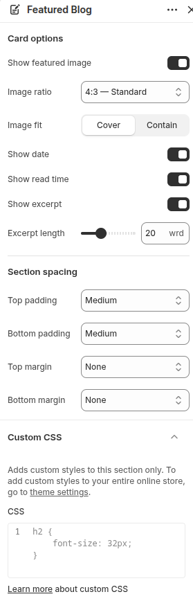
- Show Featured Image: Enable or disable the featured image displayed on blog cards.
-
Image Ratio:
Choose the aspect ratio of featured images.
- Adapt to Image – Uses the original image dimensions.
- 1:1 – Displays images in a square ratio.
- 4:3 – Standard – Displays images in a standard landscape ratio.
- 16:9 – Displays images in a widescreen ratio.
-
Image Fit:
Controls how images fit within the image area.
- Cover – Fills the image area completely and may crop parts of the image.
- Contain – Displays the entire image without cropping.
- Show Date: Display or hide the article publish date.
- Show Read Time: Display or hide the estimated reading time.
- Show Excerpt: Display or hide the article excerpt.
- Excerpt Length: Control the number of words displayed in the article excerpt.
- Top Padding: Select the spacing above the section content.
- Bottom Padding: Select the spacing below the section content.
- Top Margin: Select the spacing above the section.
- Bottom Margin: Select the spacing below the section.
- Custom CSS: Add custom CSS styles that apply only to this Featured Blog section.
Footer Settings
Configure the footer layout, content, links, and branding elements displayed at the bottom of your store.
-
Login Shopify Admin -> Online Store -> Themes -> Edit Theme -> Footer -> Add Section
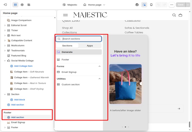
Add Sections Under Footer
Follow these steps to add sections inside the Footer group.
- Scroll to the Footer group in the Theme Editor.
- Click "Add Section" under the Footer group.
- In the section picker popup, browse the available footer-compatible sections.
-
Select the section you want to add, such as:
- Email Signup
- Footer
- Configure the section settings according to your requirements.
Email Signup Section
Configure the Email Signup section to collect newsletter subscribers, promote updates, and grow your email marketing audience.
-
Scroll to Footer -> Click "Add Section" -> Select "Email Signup"
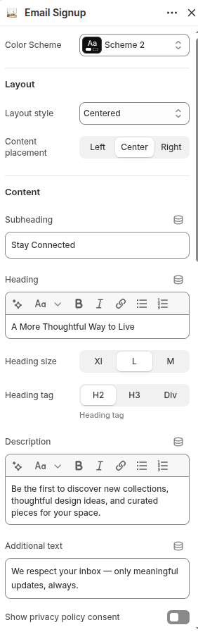
- Color Scheme: Select a color scheme from the available options.
- Layout Style: Choose the overall layout for the Email Signup section.
-
Content Placement:
Choose the alignment of the content.
- Left – Align content to the left.
- Center – Align content to the center.
- Right – Align content to the right.
- Subheading: Add a short text displayed above the main heading.
- Heading: Enter the main title for the section.
-
Heading Size:
Select the size of the heading.
- XL – Extra large heading size.
- L – Large heading size.
- M – Medium heading size.
-
Heading Tag:
Choose the HTML tag used for the heading.
- H2 – Heading level 2.
- H3 – Heading level 3.
- Div – Uses a standard div element.
- Description: Add supporting text below the heading.
- Additional Text: Add extra content displayed below the email form.
- Show Privacy Policy Consent: Enable or disable a privacy policy consent checkbox.
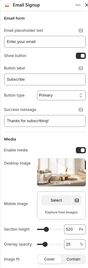
- Email Placeholder Text: Enter the placeholder text displayed inside the email input field.
- Show Button: Enable or disable the submit button.
- Button Label: Enter the text displayed on the button.
- Button Type: Select the visual style of the button.
- Success Message: Enter the message displayed after a successful subscription.
- Enable Media: Enable or disable media displayed in the section.
- Desktop Image: Select or upload an image displayed on desktop devices.
- Mobile Image: Select or upload an image displayed on mobile devices.
- Section Height: Adjust the height of the Email Signup section.
- Overlay Opacity: Control the opacity of the image overlay.
-
Image Fit:
Controls how images fit within the media area.
- Cover – Fills the available area and may crop parts of the image.
- Contain – Displays the entire image without cropping.
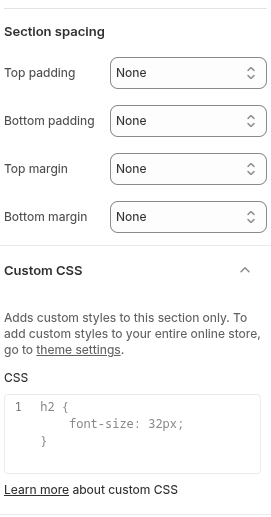
- Top Padding: Select the spacing above the section content.
- Bottom Padding: Select the spacing below the section content.
- Top Margin: Select the spacing above the section.
- Bottom Margin: Select the spacing below the section.
- Custom CSS: Add custom CSS styles that apply only to this Email Signup section.
Pages and Templates
Learn how to create pages, assign theme templates, and customize their content and layout.
-
Shopify Admin -> Online Store -> Pages -> Click "Add Page"
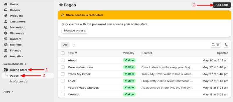
Create an About Us Page
You can either use the pre-designed About template provided by the theme or create your own custom About Us page using Shopify's page editor.
-
Shopify Admin -> Online Store -> Pages -> Add Page
Option 1: Use the Theme's About Template
- Create a new page and enter your About Us content.
- Under the Theme Template option, select the About template.
- Click Save to apply the template to the page.
-
Go to
Online Store -> Themes -> Customizeand select the About template from the page selector to customize its sections and content.
Option 2: Create a Custom About Us Page
- Create a new page and add your own content, images, videos, and other information using the Shopify editor.
- Select the Default Page template or any custom page template you have created.
- Click Save to publish the page.
- Add the About Us Page to Navigation
-
Go to
Online Store -> Navigation. - Open the menu where you want to display the About Us page.
- Click Add Menu Item and select the About Us page.
- Click Save Menu to apply the changes.
Create a Collection Page
You can create collection pages to organize and display products by category, type, brand, or any custom grouping.
-
Shopify Admin -> Products -> Collections
- Step 1: Click Create Collection.
- Step 2: Enter a title and description for the collection.
- Step 3: Upload a collection image if required.
-
Step 4:
Choose the collection type:
- Manual Collection – Add products manually.
- Automated Collection – Products are added automatically based on conditions.
- Step 5: Add products to the collection or configure collection conditions.
- Step 6: Configure collection SEO settings if required.
- Step 7: Click Save to create the collection.
-
Step 8:
Go to
Online Store -> Navigation. - Step 9: Open the menu where you want to display the collection.
- Step 10: Click Add Menu Item and select the collection.
- Step 11: Click Save Menu to apply the changes.
Create a Contact Page
Follow the steps below to create and configure a Contact page in your Shopify store.
-
Shopify Admin -> Online Store -> Pages -> Add Page
- Step 1: Click Add Page.
- Step 2: Enter Contact Us as the page title.
- Step 3: Under the Theme Template option, select the Contact template.
- Step 4: Click Save to create the page.
-
Step 5:
Go to
Online Store -> Themes -> Customize. - Step 6: Select the Contact page template from the page selector.
- Step 7: Customize the Contact page sections, form, map, and content as needed.
-
Step 8:
Add the Contact page to your Main Menu or Footer Menu through
Content -> Menus.
Create a Shop Page (All Products)
Follow the steps below to add a Shop menu item that displays all products in your store.
-
Shopify Admin -> Content -> Menus -> Main Menu
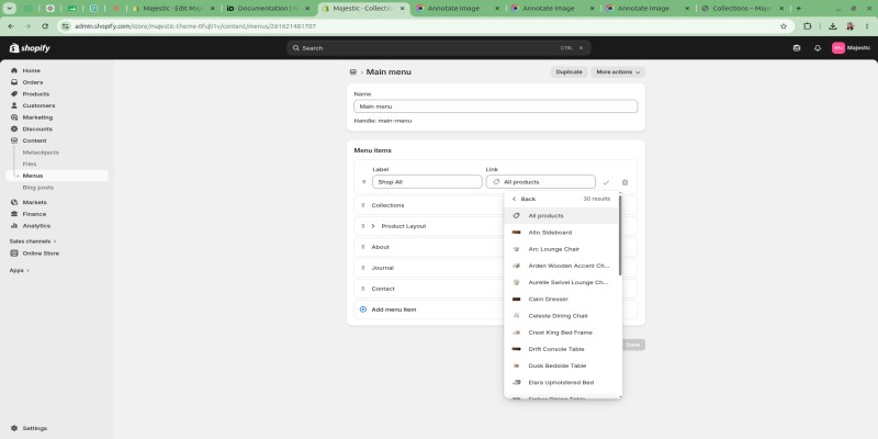
- Step 1: Open the Main Menu.
- Step 2: Click Add Menu Item.
- Step 3: Enter Shop All or your preferred menu label in the Label field.
- Step 4: Click the Link field.
- Step 5: Select All Products from the Products option.
- Step 6: Click the checkmark icon to confirm the menu item.
- Step 7: Click Save to apply the changes.
- Step 8: Visit your storefront and click the Shop All menu item to view all products.
Create a Journal Blog Page
Follow the steps below to create a Journal blog category and display only Journal posts on your Journal page.
-
Shopify Admin -> Content -> Blog Posts -> Manage Blogs
- Step 1: Click Add Blog.
- Step 2: Enter Journal as the blog name and click Save.
-
Step 3:
Go to
Content -> Blog Posts -> Add Blog Post. - Step 4: Create your blog posts and select Journal from the Blog dropdown.
- Step 5: Repeat the process for all posts you want to display on the Journal page.
- Create a Journal Page
-
Go to
Online Store -> Navigation. - Click Add Menu Item.
- Enter Journal as the menu label.
- Select the Journal Blog link from the available blog options.
- Click Save.
Footer Part
Add Footer Blocks
Configure Footer blocks to display company information, navigation menus, social links, and additional content in the footer area.
-
Scroll to Footer -> Click "Add Block" -> Select a block type -> Configure the block settings
Available Footer Blocks
- About / Text – Display company information, brand description, and social media icons.
- Menu – Display navigation links from a selected Shopify menu.
Add About / Text Block
Use the About / Text block to display your brand story, company information, or other custom text content.
-
Under Footer -> Click "Add Block" -> Select "About / Text" -> Configure the block settings
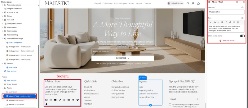
- Heading: Enter the title displayed above the text content.
- Text: Add your company description, brand story, or custom content.
- Show Social Icons: Enable or disable social media icons below the text content.
Add Menu Block
Use the Menu block to display navigation links from any Shopify menu.
-
Under Footer -> Click "Add Block" -> Select "Menu" -> Configure the block settings
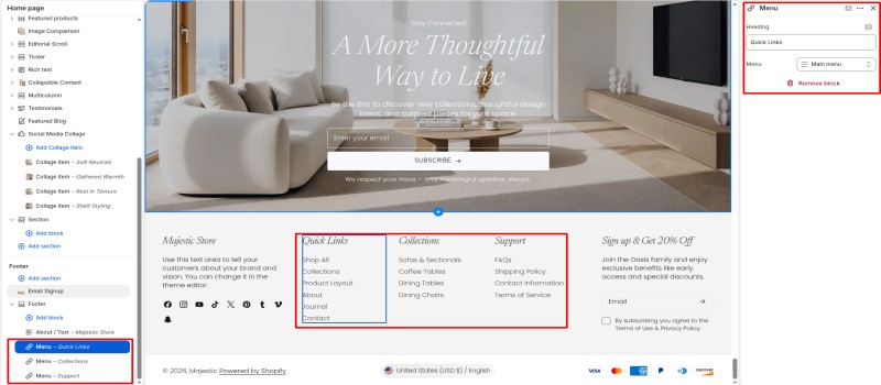
- Heading: Enter the title displayed above the menu links.
- Menu: Select the Shopify navigation menu to display in the footer.
Note: You can add multiple Menu blocks to create separate footer columns such as Quick Links, Collections, Support, Policies, and more.
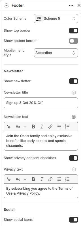
- Color Scheme: Select a color scheme for the footer section.
- Show Top Border: Enable or disable the top border of the footer.
- Show Bottom Border: Enable or disable the bottom border of the footer.
-
Mobile Menu Style:
Choose how footer menus are displayed on mobile devices.
- Accordion – Displays footer menus as expandable accordions.
- Expanded – Displays all footer menu links by default.
- Show Newsletter: Enable or disable the newsletter signup form in the footer.
- Newsletter Title: Enter the title displayed above the newsletter form.
- Newsletter Text: Add supporting text displayed below the newsletter title.
- Show Privacy Consent Checkbox: Enable or disable the privacy consent checkbox.
- Privacy Text: Enter the privacy notice displayed below the newsletter form.
- Show Social Icons: Enable or disable social media icons in the footer.
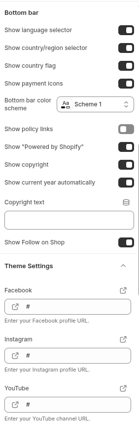
- Show Language Selector: Display a language selection dropdown.
- Show Country/Region Selector: Display a country or region selector.
- Show Country Flag: Display country flags alongside selectors.
- Show Payment Icons: Display accepted payment method icons.
- Bottom Bar Color Scheme: Select a color scheme for the footer bottom bar.
- Show Policy Links: Display store policy links in the footer.
- Show "Powered by Shopify": Display or hide the Shopify attribution text.
- Show Copyright: Display copyright information.
- Show Current Year Automatically: Automatically display the current year.
- Copyright Text: Enter custom copyright text.
- Show Follow on Shop: Display the Follow on Shop button.
- Facebook: Enter your Facebook profile URL.
- Instagram: Enter your Instagram profile URL.
- YouTube: Enter your YouTube channel URL.
- TikTok: Enter your TikTok profile URL.
- X (Twitter): Enter your X (Twitter) profile URL.
- Pinterest: Enter your Pinterest profile URL.
- LinkedIn: Enter your LinkedIn profile URL.
- Vimeo: Enter your Vimeo profile URL.
- Tumblr: Enter your Tumblr profile URL.
- Snapchat: Enter your Snapchat profile URL.
Social Media Collage Section
Configure the Social Media Collage section to showcase social media content, user-generated images, and lifestyle inspiration in a visually engaging collage layout.
Click "Add Section" -> Search For "Social Media Collage" Section -> Select itAdd Collage Items
Configure individual collage items to display social media posts, images, videos, and promotional content.
Under Social Media Collage -> Click "Add Collage Item" -> Configure Item Settings (Follow the same steps to create multiple collage items)